
Build 10x products in minutes by chatting with AI - beyond just a prototype.
What are Flutter widgets?
What are the different categories of Flutter widgets?
What is the difference between Stateless and Stateful widgets?
What are some commonly used Flutter widgets?
How to identify widgets in Flutter?
Flutter is Google’s UI toolkit for crafting beautiful, natively compiled iOS and Android apps using a single code base. The Flutter app is designed using widgets – These are the basic building blocks of every Flutter application. Widgets describe what the app UI should look like given its current configuration and state.
There are multiple Flutter widgets, the articles give you a quick look into the basic Flutter widgets, types, and categories.
Flutter has become a star in the eyes of Android and iOS developers by empowering them to build cross-platform apps using a single codebase. The technology seems to be successfully overcoming the three big challenges in app development.
All that brings much relief for the developer's community as they now have more time for creative things in app development.
Well, now we know how useful Flutter is for smoothly building beautiful cross-platform apps. Let's know about the basic building blocks of the Flutter application known as Flutter widgets.
Each element on the Flutter UI is a widget such as text, container, image, button, animations, and motions. So, the view of a screen completely depends on the choice and the sequence of the Flutter widgets used in building the application. Therefore the structure formed by the application code is called a tree of widgets.
These widgets can be classified into the following fourteen categories according to the functionality they provide in the Flutter application.
| Category | Description |
|---|---|
| Accessibility | Makes the app more accessible. |
| Animation and motions | Add animation to the widgets. |
| Assets image and icon | Manage assets, display images, and show icons. |
| Async | Provides async functionality to the Flutter application. |
| Basics | Essential widgets for the Flutter application development. |
| Cupertino | Beautiful and high-fidelity widgets for iOS styling. |
| Input | Take user input in addition to input widgets in Material Components and Cupertino. |
| Interaction Models | Respond to touch events and route users to different views. |
| Layout | Arranges other widgets, columns, rows, grids, and other layouts. |
| Material Components | Visual, behavioral, and motion-rich widgets that follow material design guidelines. |
| Painting and Effects | Set of widgets that add visual changes to their child widgets without changing their layout and shape. |
| Scrolling | Scrolls multiple widgets as the children of the parents. |
| Styling | It deals with the theme, responsiveness, and sizing of the app. |
| Text | It displays and styles text. |
In general Flutter widgets are classified into two categories,
1. Stateless Widget 2. Stateful Widget
However, you can find more classes in the hierarchy of Flutter sources .
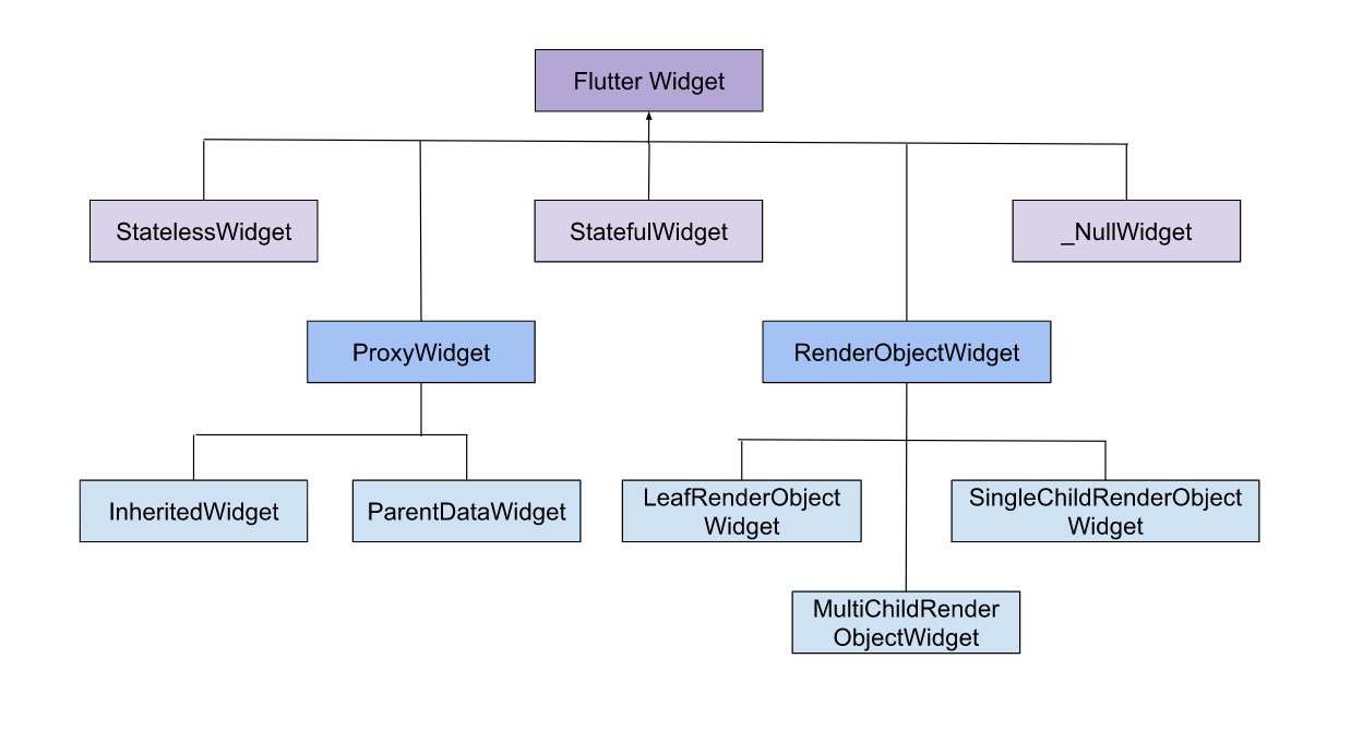 Flutter Widget Types
StatelessWidget: The widget does not require a mutable state.
StatefulWidget: The widget has a mutable state i.e state information can be read synchronously when it is built and it may change during the widget's lifetime. Therefore it's essential to ensure that the state is promptly notified when the change occurs using setState.
ProxyWidget: The Widget has a child widget provided to it, instead of building a new widget. It is useful as a base class for other widgets like InheritedWidget and ParentDataWidget.
RenderObjectWidget: It provides the configuration for the RenderObjectElements, which wrap RenderObjects, that provide the actual rendering of the application.
InheritedWidget: It is a base class for widgets that efficiently propagates information down the tree. To obtain the near instance of a particular type of inherited widget from a build context, use BuildContext.dependOnInheritedWidgetOfExactType . When referenced in this way, it causes the consumer to rebuild when the inherited widget itself changes state.
ParentDataWidget: It is a base class for a widget that hooks ParentData information to children of RenderObjectWidgets. It is used to provide a per-child configuration for RenderObjectWidgets with more than one child.
LeafRenderObjectWidget: It is a superclass for RenderObjectWidgets that configure RenderObject subclasses that have no children.
SingleChildRenderObjectWidget: It is a superclass for RenderObjectWidgets that configure RenderObject subclasses that have a single child slot.
MultiChildRenderObjetWidget: It is a superclass for RenderObjectWidgets that configure RenderObject subclasses that have a single list of children.
_NullWidget: Zero cost widget. Use it when you need a placeholder.
A Material Design app bar. An app bar consists of a toolbar and potentially other widgets, such as a TabBar and a FlexibleSpaceBar.
Code Example:
Output:
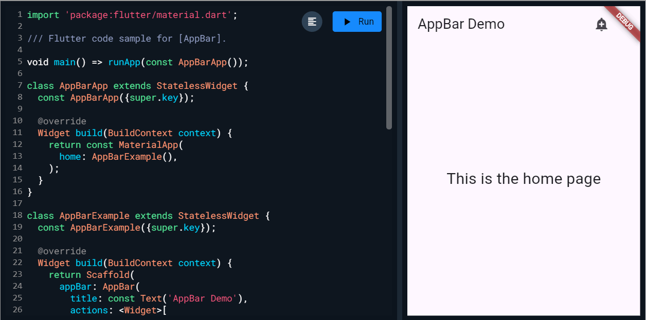 AppBar
Layout a list of child widgets in the vertical direction.
Code Example:
Output:
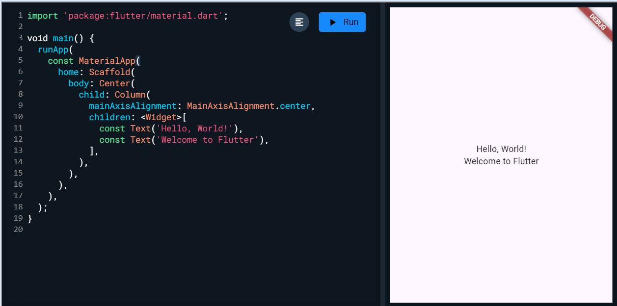 Column
A convenience widget that combines common painting, positioning, and sizing widgets.
Code Example:
Output:
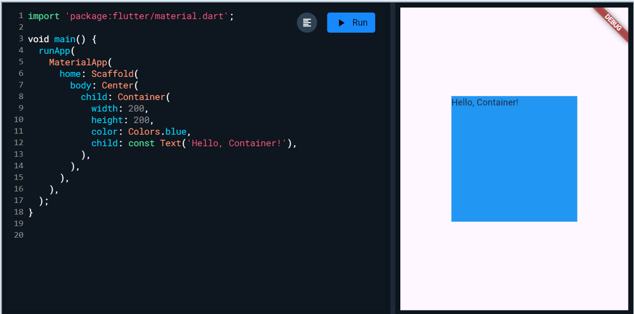 Container
A Material Design elevated button. A filled button whose material elevates when pressed.
Code Example:
Output:
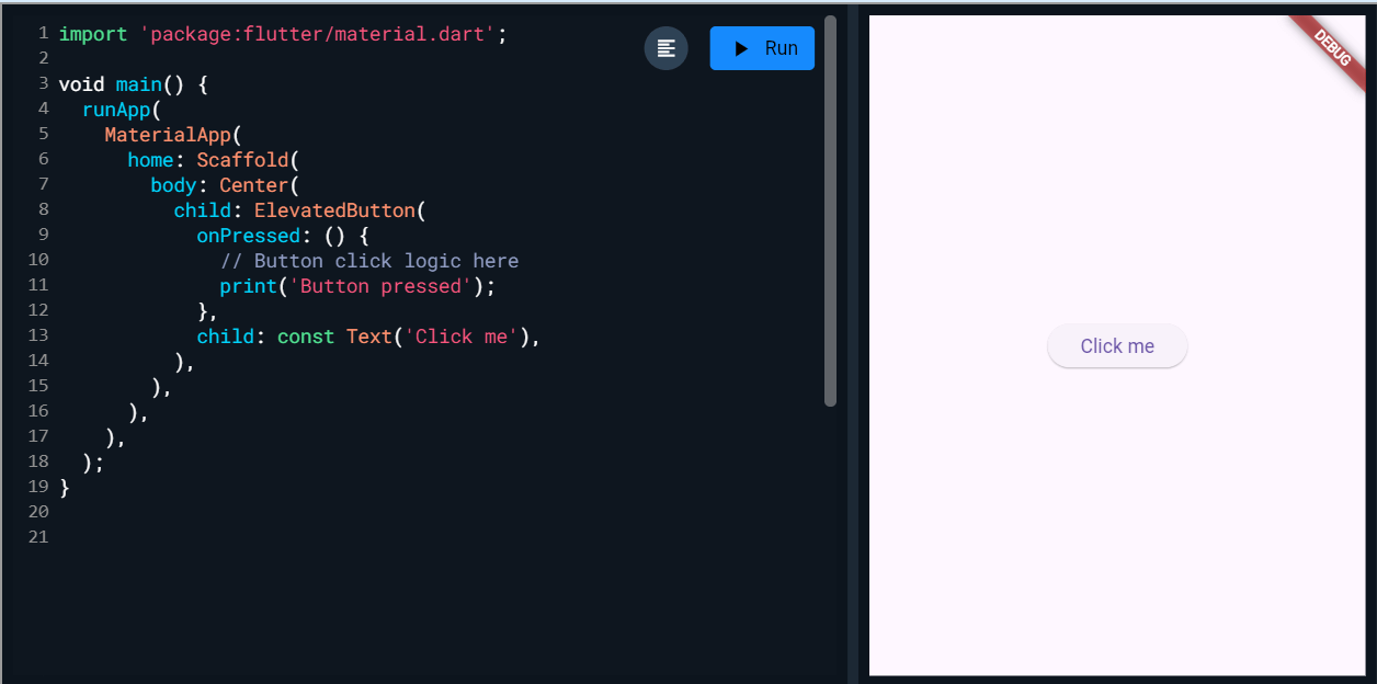 ElevatedButton
The Flutter logo, in the widget form. This widget respects the IconTheme.
Code Example:
Output:
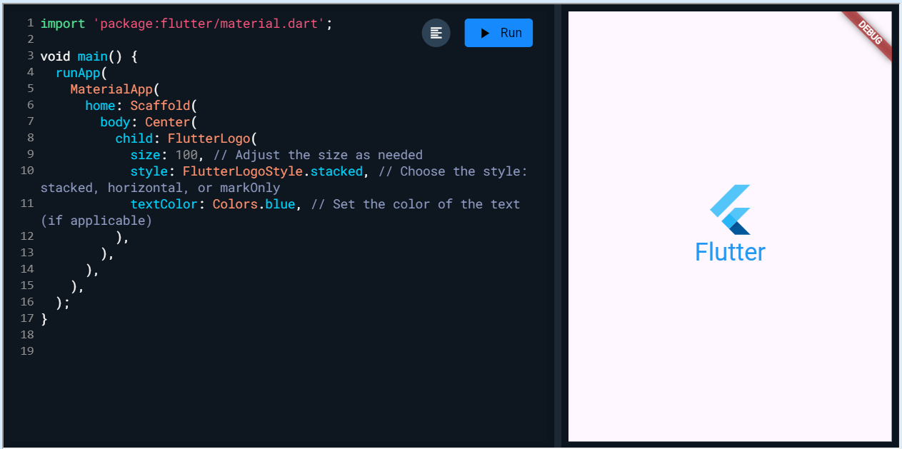 FlutterLogo
A Material Design icon.
Code Example:
Output:
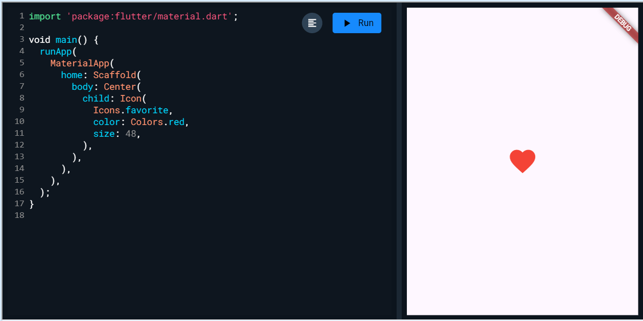 Icon
Icon
A widget that displays an image.
Code Example:
Output:
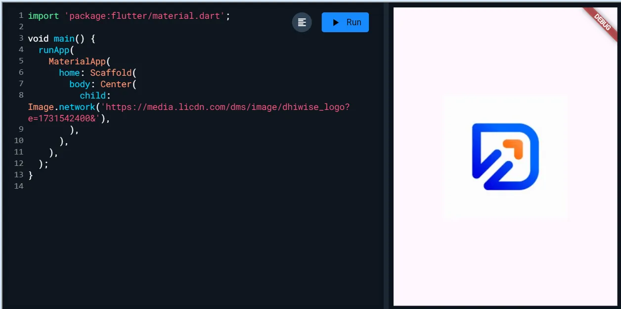 Image
Image
A widget that draws a box that represents where other widgets will one day be added.
Code Example:
Output:
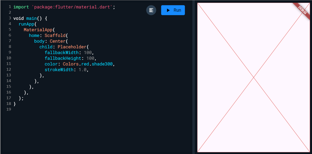 Placeholder
Layout a list of child widgets in the horizontal direction.
Code Example:
Output:
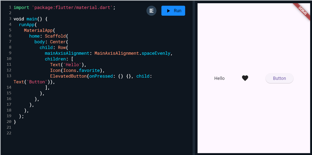 Row
Row
for displaying strings of text. It provides basic styling options to control the appearance of the text.
Code Example:
Output:
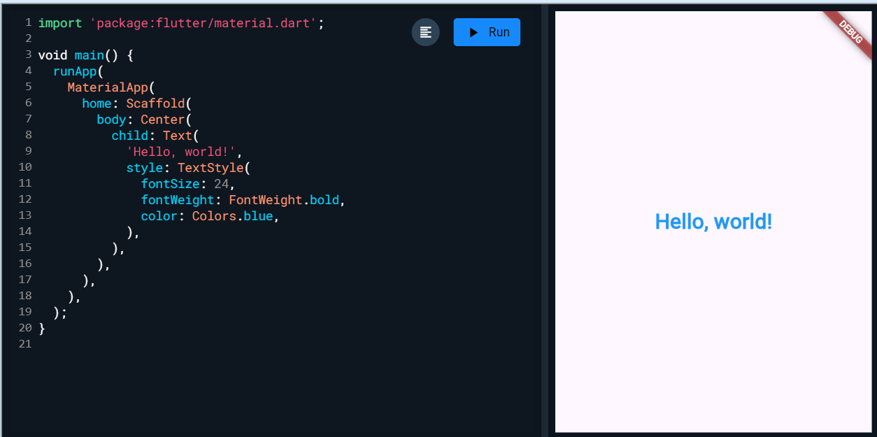 Text
Text
Also, read our article on medium to know about the popular animation widgets for creating an intuitive UI.
And here you have it; everything about the Flutter widgets!! Hope you find it useful to get a quick view of Flutter's basic widgets, categories, and types.
Dart
import 'package:flutter/material.dart';


/// Flutter code sample for [AppBar].


void main() => runApp(const AppBarApp());


class AppBarApp extends StatelessWidget {
  const AppBarApp({super.key});


  @override
  Widget build(BuildContext context) {
    return const MaterialApp(
      home: AppBarExample(),
    );
  }
}


class AppBarExample extends StatelessWidget {
  const AppBarExample({super.key});


  @override
  Widget build(BuildContext context) {
    return Scaffold(
      appBar: AppBar(
        title: const Text('AppBar Demo'),
        actions: <Widget>[
          IconButton(
            icon: const Icon(Icons.add_alert),
            tooltip: 'Show Snackbar',
            onPressed: () {
              ScaffoldMessenger.of(context).showSnackBar(
                  const SnackBar(content: Text('This is a snackbar')));
            },
          ),
          IconButton(
            icon: const Icon(Icons.navigate_next),
            tooltip: 'Go to the next page',
            onPressed: () {
              Navigator.push(context, MaterialPageRoute<void>(
                builder: (BuildContext context) {
                  return Scaffold(
                    appBar: AppBar(
                      title: const Text('Next page'),
                    ),
                    body: const Center(
                      child: Text(
                        'This is the next page',
                        style: TextStyle(fontSize: 24),
                      ),
                    ),
                  );
                },
              ));
            },
          ),
        ],
      ),
      body: const Center(
        child: Text(
          'This is the home page',
          style: TextStyle(fontSize: 24),
        ),
      ),
    );
  }
}
import 'package:flutter/material.dart';

void main() {
  runApp(
    const MaterialApp(
      home: Scaffold(
        body: Center(
          child: Column(
            mainAxisAlignment: MainAxisAlignment.center,
            children: <Widget>[
              const Text('Hello, World!'),
              const Text('Welcome to Flutter'),
            ],
          ),
        ),
      ),
    ),
  );
}
import 'package:flutter/material.dart';
void main() {
  runApp(
    MaterialApp(
      home: Scaffold(
        body: Center(
          child: Container(
            width: 200,
            height: 200,
            color: Colors.blue,
            child: const Text('Hello, Container!'),
          ),
        ),
      ),
    ),
  );
}
import 'package:flutter/material.dart';


void main() {
  runApp(
    MaterialApp(
      home: Scaffold(
        body: Center(
          child: ElevatedButton(
            onPressed: () {
              // Button click logic here
              print('Button pressed');
            },
            child: const Text('Click me'),
          ),
        ),
      ),
    ),
  );
}
import 'package:flutter/material.dart';


void main() {
  runApp(
    MaterialApp(
      home: Scaffold(
        body: Center(
          child: FlutterLogo(
            size: 100, // Adjust the size as needed
            style: FlutterLogoStyle.stacked, // Choose the style: stacked, horizontal, or markOnly
            textColor: Colors.blue, // Set the color of the text (if applicable)
          ),
        ),
      ),
    ),
  );
}
import 'package:flutter/material.dart';
void main() {
  runApp(
    MaterialApp(
      home: Scaffold(
        body: Center(
          child: Icon(
            Icons.favorite,
            color: Colors.red,
            size: 48,
          ),
        ),
      ),
    ),
  );
}
import 'package:flutter/material.dart';
void main() {
  runApp(
    MaterialApp(
      home: Scaffold(
        body: Center(
          child: Image.network('https://media.licdn.com/dms/image/dhiwise_logo?e=1731542400&'),
        ),
      ),
    ),
  );
}
import 'package:flutter/material.dart';
void main() {
  runApp(
    MaterialApp(
      home: Scaffold(
        body: Center(
          child: Placeholder(
            fallbackWidth: 100,
            fallbackHeight: 100,
            color: Colors.red.shade300,
            strokeWidth: 1.0,
          ),
        ),
      ),
    ),
  );
}
import 'package:flutter/material.dart';
void main() {
  runApp(
    MaterialApp(
      home: Scaffold(
        body: Center(
          child: Row(
            mainAxisAlignment: MainAxisAlignment.spaceEvenly,
            children: [
              Text('Hello'),
              Icon(Icons.favorite),
              ElevatedButton(onPressed: () {}, child: Text('Button')),
            ],
          ),
        ),
      ),
    ),
  );
}
import 'package:flutter/material.dart';
void main() {
  runApp(
    MaterialApp(
      home: Scaffold(
        body: Center(
          child: Text(
            'Hello, world!',
            style: TextStyle(
              fontSize: 24,
              fontWeight: FontWeight.bold,
              color: Colors.blue,
            ),
          ),
        ),
      ),
    ),
  );
}